Here is a final blog post of all the map I made in my Geography 200 course, Geographic Techniques. Each map highlights certain skills and applications in mapping geographic information representing the real world. I became familiar with Adobe Illustrator CS6 and further practiced my skills in ArcGIS.
Africa Reference Map

This was our first map of the semester, this is where we first applied our knowledge of adobe illustrator CS6, the five essentials of map design: Figure-ground, legibility, clarity, balance, and visual hierarchy, and we applied map elements such as title, legend, scale, data information, neat line, labels, etc. This map was a good introduction to the complications to mapping, for example trying to fit all the labels within their appropriate boundaries wasn’t always possible and having to place guidelines for labeling phenomenon’s such as rivers or desert ranges. I used a 6 distinct hues to color this map, I wanted something that wasn’t overly bright and overwhelming instead I picked neutral colors that were still able to pop out for the reader. For my first map I’d say it’s not too shabby but now as I look back at it there are definitely areas for improvement.
Projections of South America

For this map we made a document stressing the importance of datums and projections and how they can drastically affect the shape, area, orientation, distance and direction. There are many different map projections that vary in distortion and this highlights the great difficulty of mapping a 3D object into a 2D projection. In order to map these differences we acquired the different map projections from ArcGIS and pasted them into Adobe Illustrator. From here we overlapped them at the 60 degrees west of the prime meridian (not featured in my map). Some difficulties I encountered were transferring the projection from ArcMap into illustrator, even slightly moving the map in ArcMap would disrupt the alignment in illustrator. I think thoroughly explaining map projections importance and keeping the legend clean was difficult. There was a lot of information to include in this assignment but I think it turned out fine. I used a light gray background to help the hues be more distinguishable.
Satellite Positioning Map

For this project I used a Garmin eTrex GPS unit and set it for a tracking mode that would collect points every 20 seconds during my run, afterwards I transferred the data to ArcGIS to be mapped. By choosing a point collection time of 20 seconds my route couldn’t be 100% accurate because it simply connects the waypoints. In fact I see that on the map when turning a corner in Carson Park it appears that I ran through the lake when in fact i didn’t! There is also some minimal inaccuracy in some places along the track but that could be because of poor satellite connection due to tree coverage or just the general disruptions that can occur while using a GPS system. This map is very simplistic, showing just the path I took on and ariel base map supplied by ESRI.
Reference Map of our Hometown 

For this map I used ArcMap to obtain an aerial image of my hometown, I arranged the image in ArcMap’s Layout View, and exported the image as an Adobe Illustrator file. I used this image along with the pen, shape, and text tools to trace the aerial image. I used green to represent parks and blue for lakes, for a discrete background I used an yellowish hue to help represent developed area whether residential, commercial, or even industrial. This project took a long time simply because I wanted to be as detailed as possible without cluttering the map and I wanted to label all relevant features in my hometown of Richfield. I’m pretty proud of the outcome of this map since I put a lot of time into it.
Carolina Choropleth Map

This assignment required that we make four choropleth maps using an equal interval classification and a quintile classification of population data in percentage or in total amount. This assignment really could have been done much faster using ArcGIS but we had to use Adobe Illustrator to individually color each county accordingly to it classification. This process took an unbearably long time. We got these results by using Excel to manipulate and organize the data into percentage, quintile, or equal interval sets. It was pretty interesting thinking that people are beginning to identify as having an “American” ancestry. Overall, despite this taking an annoyingly unnecessary amount of time this map was fun to interpret and display the data. I used “cool” colors to represent the data and a warm orange color to contrast the maps, Also I added some patriotic stars to add a little flare to the map. All data was gathered from the US 2010 Census.
Proportional Symbol Map

This map required that we find data and map it using proportional symbols. I got my information from the Minnesota DNR and got the Minnesota map from the US Census Bureau. I transferred the DNR data into excel and organized them proportionally by taking the percentage. I then was able to transform my symbols in Adobe Illustrator to the matching percentage value. I used a blue background for Minnesota and a contrasting orange for the symbols.
Bivariate Symbol Map 

Our bivariate maps required that we find two relatable features and map one using choropleth methods and the other using proportional symbol methods. I choose average annual snowfall and state population. I got my data from the US census Bureau and a website called currentresult.com. I chose a two toned color scheme for my choropleth map, the cool blue and green hues help represent cold temperatures and snow and the warmer tone of an off white help represent data where there is little to no snow yearly. For the symbols I chose orange and slightly transparent because some of the symbols had to be larger than the state in order to distinguish them all. One of the problems I encountered for this map was fitting everything on the page and finding an appropriate size for the proportional symbols.
GIS Proportional and Choropleth 


For these two maps we were able to make a proportional symbol map and a choropleth map using a simpler method in ArcMap. For the first map (choropleth) I decided to map the senior citizen population and see if there were any noticeable patterns across the united states. To do this we went into the properties for counties and in the symbology tab I chose to map the percentage of age 65+ normalized by total population. I set a color scheme and it was as simple as that! For my second map (proportional symbol) I wanted to see where most of the kids in the united states lived. This process was similar to the choropleth map but I normalized it by square mile to get population density and I set it to be expressed using proportional symbols. Data and map were supplied by ESRI and the US Census Bureau.
GIS Mapping Data

This exercise was geared towards the completion of a map depicting percentages of Whites (European Americans), Blacks (African Americans), Asian Americans, and Hispanics/Latino(a)s in an American city of my choice at the census tract level. I choose the city of Boston to map these percentages. For this assignment we were given a map to zoom to our desired area of interest and from here I added three new data frames of the same scale and position as the first one by copying and pasting the first. I was able to map the percentage of each “classification” by normalizing by total population and choosing a unique color scheme for each representation. I used a light grey background for the neat line to help bring attention to the colors of each map. I had a little difficulty with finding a satisfying layout for this assignment trying to fit every element in an appropriate place on the document. Eventually I found one that was satisfying. Data was retrieved from the US Census Bureau and the map from ESRI.
Map Critiques

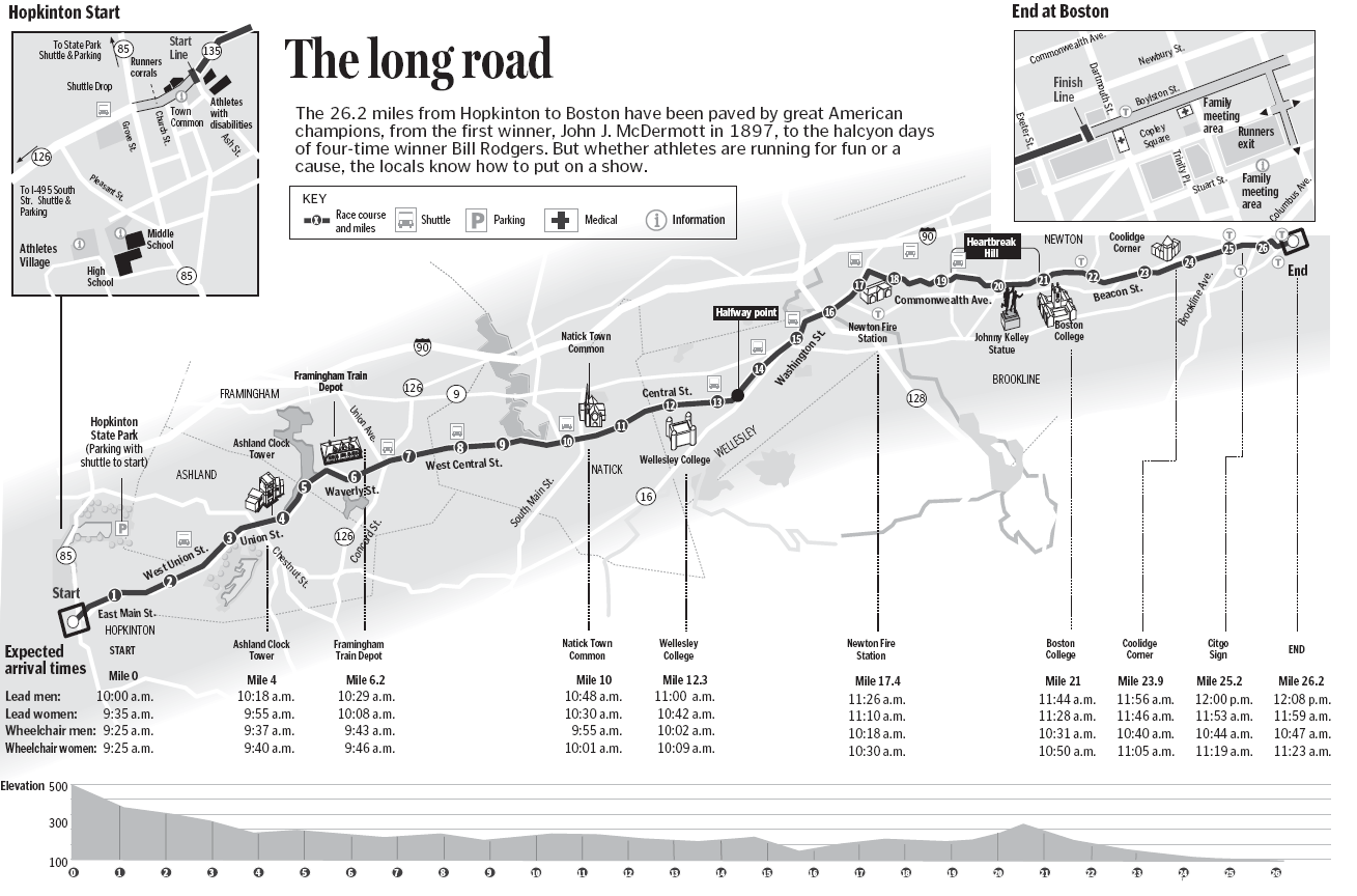
Figure Ground: Since this image is in black and white it is at a little disadvantage in depicting important features from non important features. Having said that I think they did well with having the darker line (the marathon route) stick out and represent importance. They have a light grey area buffering the marathon area the help highlight important streets and landmarks.
Legibility: There is a lot of information for the map readers to take in on this map. I think the author does a good job organizing it. The make the start and finish magnified as they are popular areas to spectate and the font is pretty lag able except maybe a few overlapping lines every now and then and some of the text is too small.
Clarity: I think there is some clarity to identifying clear separation between objects but I feel like it could be better. For example some of the roads are white and some are a medium grey? The author could have labeled the map better or make features more uniform.
Balance: I really like the balance of this map, Having the start and finish in the upper corners and the elevation at the bottom in line with the actual race is nice. The title should either have all the first letter capitalized or non at all if they were going for an artsy affect.
Visual Hierarchy: The author fits a lot of information on this map and I think they pull off the visual hierarchy pretty well. Important land marks stick out and the background is not distracting. I’d say the author did very well with this map.
Map 2: http://www.nasa.gov/sites/default/files/styles/673xvariable_height/public/forest-cover-global.png?itok=SzC6ccIf

Figure Ground: I think this map does a great job with the figure ground! The Ground is a very dark great and the countries are black where the figure is a bright color that is really discernible against the dark.
Legibility: I think this map is pretty legible, I think all objects are able to be identified.
Clarity: Since this map is small I feel like sometimes its hard to see where one color stops and another ends. For instance in the lower east end of the United States, the purple representing loss and gain is a little hard to look at and see clearly.
Balance: The balance in this map is pretty simplistic as there aren’t a lot of element to this map. I feel like the legend could be placed and arranged differently, maybe move it to the right corner and have it set vertically instead of horizontal.
Visual Hierarchy: For me the legend draws a lot more attention then desired for this map. I also feel like its in an awkward position (see balance). The title is fine where it is and doesn’t draw too much attention. I really like the colors chased for this map that definitely helps draw in the readers gaze to areas of importance, the contrasting red and green was a smart idea.
MAP 3: http://info.geonet.org.nz/download/attachments/950275/Deep_Seismicity.png

Figure Ground: This map has a simple white background drawing no attention and a vibrant figure color to draw attention. It simplistic and achieves its goal.
Legibility: The legibility of this map is good, the colors are distinguishable and the legend is understandable.
Clarity: This map isn’t supposed to be 100% clear because there have been so many earthquakes in the last ten years that the proportional symbols overlap. However, the general pattern is very clear and some major symbols are able to stick out.
Balance: I like how this mapped incorporated latitude and longitude into the border of the map. and the placement of the title and legend is fine. The Upper left hand of the page is heavier than the lower right which is practically empty. Maybe they could have filled that part with something to balance the whole page.
Visual Hierarchy: The visual hierarchy appears to be in the right order to me!
MAP 4: http://www.mappery.com/maps/University-of-Minnesota-Twin-Cities-Campus-Map.mediumthumb.jpg

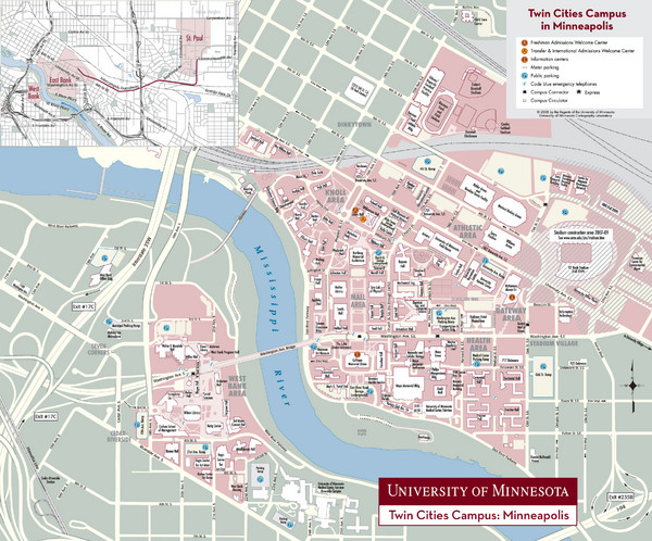
Figure Ground: The figure (campus) is clearly colored in a pinkish hue and the ground is a pale green with roads colored yellow. The whole pallet used is made up of pale neutral colors the compliment each other.
Legibility: legibility is a little difficult with the campus being so large so the labels have to be small. I would try to place items like the legend elsewhere in hopes to maybe be able to zoom into campus more to make it more legible.
Clarity: I feel like here the clarity also struggles for much of the same reason. The scale is too small. I feel like some of the symbol colors could be more vibrant or a different hue because some of them aren't discernible from the figure color.
Balance: I feel like the balance is good but for purposes of having a smaller scale maybe the maps legend, title, and reference map be rearranged to improve visibility and clarity of the map itself.
Visual Hierarchy: I like the colors that help emphasize the campus area and I feel like this map fulfills its purpose and I believe it to be easily read by those who know the area well, but I would not recommend this map for visitors due to the legibility issues. I like the fonts and the label of the Mississippi River is well done.MAP 5: http://maps.unomaha.edu/Peterson/geog1000/MapLinks/ReligionMaps_files/churchbodies.gif

Figure Ground: This map in my mind has a classic example of a good figure ground. the ground is gray and the United States is an appropriate color for the visual importance of the map.
Legibility: This map is very legible, some text could be larger but I feel like this map is easy for a reader to understand.
Clarity: The colors are very distinguishable from each other so I think the colors are perfect for this map. It is a very easy map to read which is one of the reasons I really like this map!
Balance: The balance is good in this map. Alaska and Hawaii aren’t taking up to much space and all available space in the Gulf of Mexico and the Atlantic is used wisely. Maybe the title could be more centered.
Visual Hierarchy: The visual hierarchy is pretty good! I really like this map, it’s really good and effective in my opinion. The whole layout is nice.MAP 6: http://www.windpoweringamerica.gov/images/windmaps/us_windmap_80meters_820w.jpg

Figure Ground: The figure ground in this map is good, there’s really no “ground” just a background so the figure is the only thing claiming importance for this map.
Legibility: This is map is easy to read and identify important elements relating to wind speed in the United States.
Clarity: This map is relatively clear, there are some areas on the map where it may become difficult to distinguish between to different values but it’s not impossible. The color choice is well thought out when transitioning from different values of wind speed.
Balance: Balance is good and all space is used effectively, the Title, legend, and Sources are well placed.
Visual Hierarchy: I think the visual hierarchy is perfect. The map is organized well and easy to read and distinguish importance and nothing seems to be inappropriately place or accentuated.
No comments:
Post a Comment